Spring Color Palette Dressing: Easy Outfit Formulas
The Art of Dressing in Spring Colors: A Practical Guide to Building a Fresh, Cohesive Wardrobe
Spring dressing gets easier when color choices feel intentional: a clear palette, a few dependable neutrals, and a repeatable outfit formula. This guide breaks down how to choose spring-leaning shades, combine them confidently, and build a wardrobe color strategy that looks bright without feeling loud—plus a resource for a deeper, step-by-step approach.
What “spring colors” look like in real outfits
“Spring colors” aren’t just pastel for pastel’s sake. In everyday outfits, they usually read as light, clear, and slightly warm-leaning—more fresh than dusty. If a shade looks like it has a soft gray veil over it, it can feel more muted-season than spring.
A practical way to picture spring color is three lanes:
- Fresh greens: mint, pistachio, light chartreuse (best when they look clean, not smoky).
- Sunny warms: butter yellow, peach, apricot, warm blush.
- Clean brights: coral, aqua, turquoise—used as a controlled pop alongside calmer pieces.
Instead of “high drama” contrast, aim for contrast that feels crisp and weightless: a light top with a mid-tone bottom, or a bright accent with a neutral base. Fabric finish also changes how color behaves: matte knits and textured cottons make brights easier to wear, while poplin or satin can make pale shades look sharper and more polished.
For color inspiration and naming conventions, browsing seasonal palettes from the Pantone Color Institute can help you identify the difference between a clear peach and a muted dusty pink.
Build a personal spring palette in 15 minutes
The fastest route to a cohesive closet is choosing fewer colors on purpose. Here’s a quick, low-pressure setup that still gives variety.
- Start with 2 anchor neutrals you already wear well. Good spring-friendly options include ivory, warm beige, light denim, camel, and soft navy.
- Pick 3 core colors that flatter your undertone and match your natural contrast (hair/eye depth). Keep them in a similar temperature—generally warm-leaning and clear—so they mix without effort.
- Add 1–2 accents for accessories only (shoes, bags, earrings, hair clips). This prevents a closet full of “almost matches” that don’t repeat.
- Create a phone album with 8–12 swatches and outfit screenshots. Treat it like a shopping filter so new purchases stay aligned.
If color theory feels abstract, a quick refresher on warm vs. cool and value (light vs. dark) from Color Matters: Color Theory Basics can make palette decisions feel much more concrete.
A simple wardrobe color strategy that prevents “nothing to wear”
When outfits feel hard, it’s often not a style problem—it’s a coordination problem. A repeatable color strategy fixes that without requiring a massive closet.
- Use a 60/30/10 split: 60% neutral base, 30% core spring color, 10% accent (often accessories).
- Repeat pairings across categories: the same mint that shows up in a blouse can reappear as sneakers, a scarf, or even a nail color.
- Keep prints on a short leash: choose patterns that include at least one neutral and one core palette color so they “plug in” easily.
- Require three outfit matches before a new item earns a place (three realistic combos with pieces you already own).
Mix-and-match formulas for spring outfits
These formulas keep spring color wearable, even if bright shades usually feel intimidating:
Spring Color Pairings That Stay Easy to Wear
| Base neutral | Core spring color | Accent | Best in | Quick outfit idea |
|---|---|---|---|---|
| Ivory | Mint | Gold | Casual + office | Ivory jeans + mint blouse + gold hoops |
| Warm beige | Peach | Tan | Daytime events | Beige trousers + peach knit + tan belt and bag |
| Light denim | Butter yellow | White | Weekend | Denim jacket + white tee + butter skirt |
| Soft navy | Coral | Camel | Smart casual | Navy wide-legs + coral top + camel flats |
| Stone gray (warm-leaning) | Aqua | Silver or pearl | Minimal looks | Gray slip skirt + aqua sweater + pearl studs |
Capsule approach: 12 pieces that cover a full spring palette
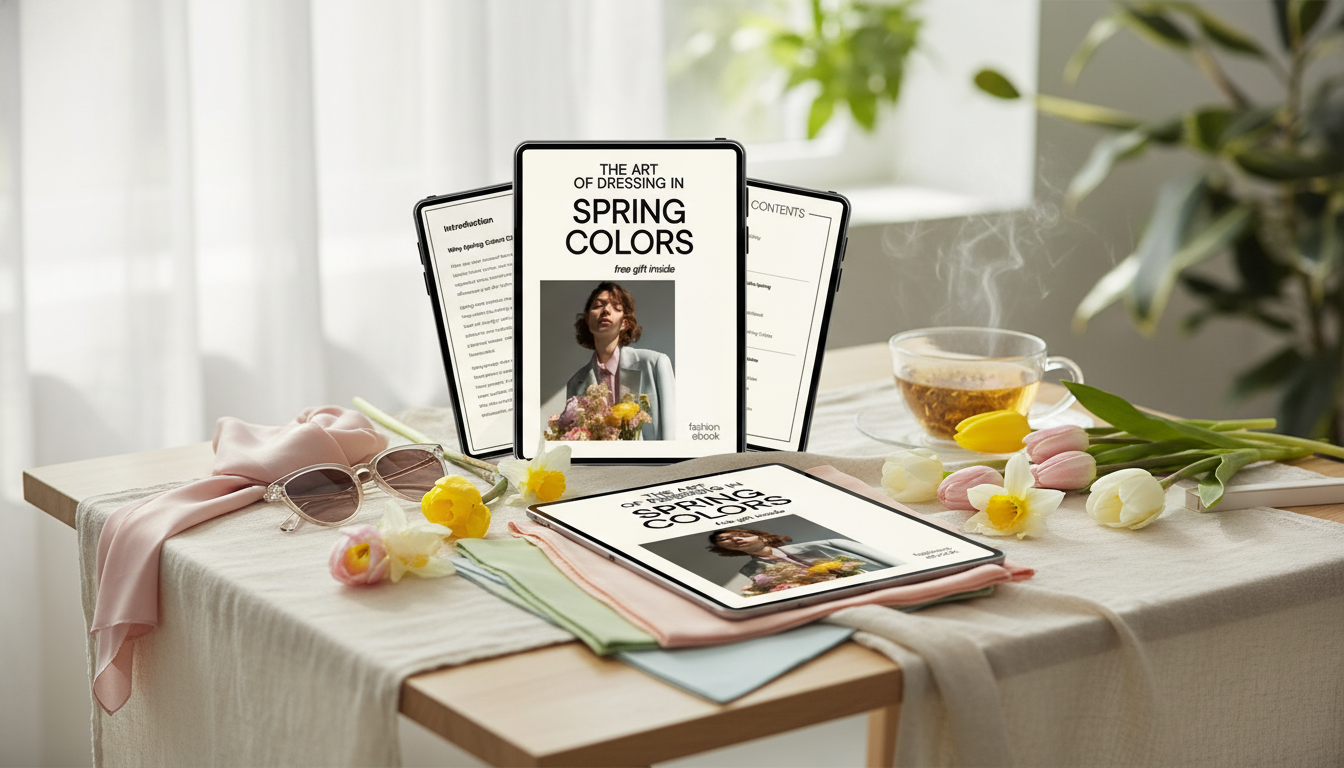
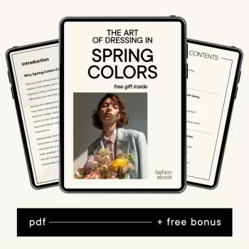
To keep purchases consistent, it helps to have a single reference you can return to when shopping or outfit-planning. The Art of Dressing in Spring Colors eBook lays out a structured palette approach, outfit formulas, and practical rules that keep a spring wardrobe coordinated across casual, office, and event looks.
Color doesn’t stop at clothing—small beauty choices can reinforce the palette without adding more garments. For a simple way to keep your look polished and cohesive, the 8pcs Professional Makeup Brush Set makes it easier to apply a warm blush, soft coral lip, or brightening highlight that echoes spring tones.
Common spring-color mistakes (and quick fixes)
A deeper, step-by-step resource for spring palette dressing
For a structured approach to selecting flattering spring shades, building outfits, and setting a repeatable wardrobe color plan, use: The Art of Dressing in Spring Colors eBook. It’s a practical choice for anyone who wants clearer shopping rules, coordinated outfit formulas, and a palette that stays fresh across casual, office, and occasion dressing.
FAQ
How can spring colors be worn without looking too bright?
Start with a neutral base (ivory, beige, or denim) and use one spring shade as the focal point. Keep the rest tonal or neutral, choose matte fabrics to soften saturation, and limit accents to small pieces like jewelry, shoes, or a bag.
What neutrals work best with spring palettes?
Ivory, warm beige, camel, light denim, and soft navy typically support warm, clear spring shades more naturally than stark black or icy gray. Pick two neutrals and repeat them often so outfits feel effortless.
How do you build a spring capsule wardrobe around color?
Choose two neutrals first, then add three core spring colors mostly in tops, and select bottoms and layers that work with every top. Keep accent colors primarily in accessories and only add new items when they create at least three outfit combinations.


Leave a comment